Overview
Balancing Usability and Premium Quality
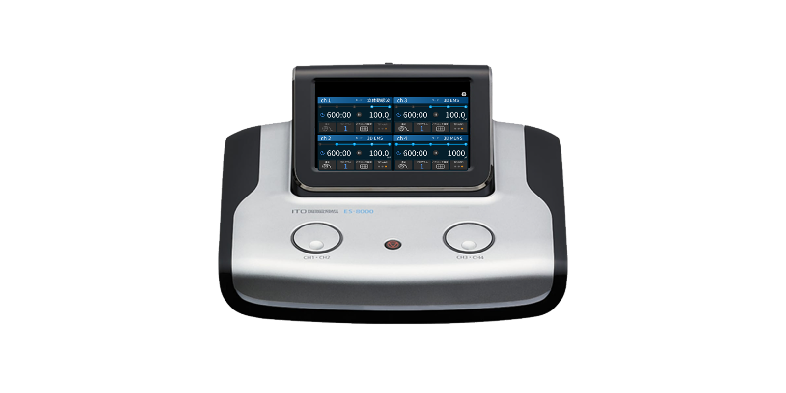
Commissioned by ITO Co., Ltd., we were responsible for the UI design of a touch-panel-operated electrical stimulation device for orthopedic and rehabilitation applications. The interface was designed to maintain intuitive operability while delivering the refined, premium feel appropriate for a high-end model.
Background
Ensuring Clear Operation on a Compact, Information-Dense Screen
As part of the development of a new model, we were asked to refresh the design and conducted a comprehensive UI redesign.
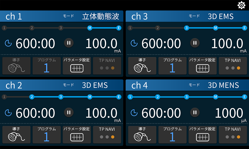
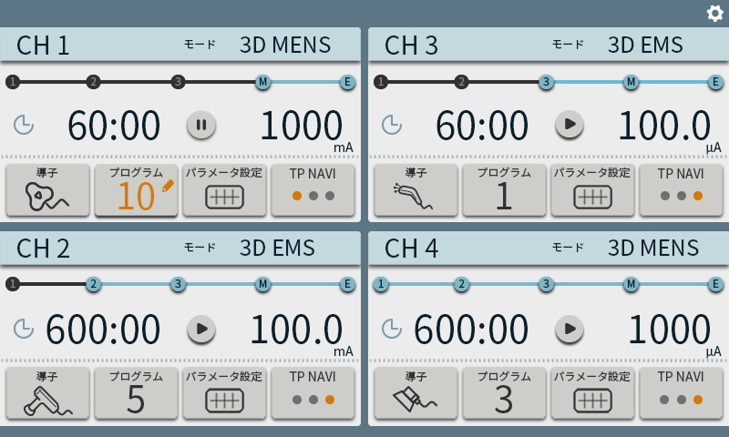
Because the device is also used in sports therapy settings, it needed to balance a sporty impression with ease of use. In addition, since multiple channels may be displayed on a compact screen, organizing information effectively became a key design challenge.
Proposal
Integrated Color Scheme and User-Oriented Button Design
We adopted a cool dark blue as the primary color, harmonizing it with the device’s silver-blue LED accents. By incorporating accent colors, we achieved both a sporty character and a premium aesthetic.
Taking into account the primary users of medical equipment—particularly the relatively high proportion of older users—we prioritized clear visibility and intuitive usability. Button sizes and spacing were carefully designed to ensure smooth operation on the touch panel, with ample clearance between controls.
Information Structuring and Intuitive “Treatment Step” Animation
To accommodate multiple sets of information on a compact screen, we organized content by visual priority and structured the layout with clear contrast and hierarchy.
Animations were introduced to make treatment steps and the current position immediately recognizable at a glance, enhancing clarity and workflow efficiency.
Two Themes for Flexible Environments
To accommodate differences in lighting conditions and user preferences, we developed both dark and light themes, allowing seamless switching between the two.