Overview
Significantly improved operability and visibility
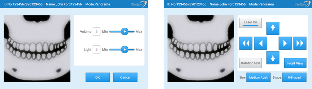
Commissioned by Plextion Co., Ltd., we renewed the UI/UX design of a dental CT 3D scanner system for overseas markets.
We comprehensively handled everything from revising screen transitions and operation flows to reconstructing the color planning and design rules.
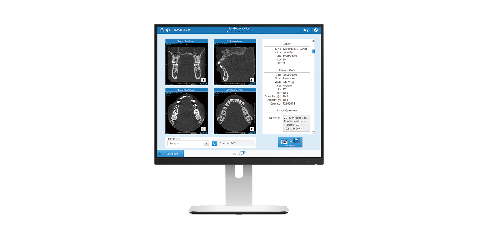
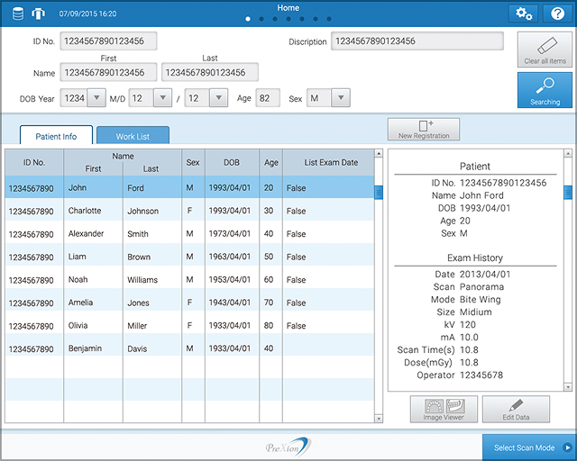
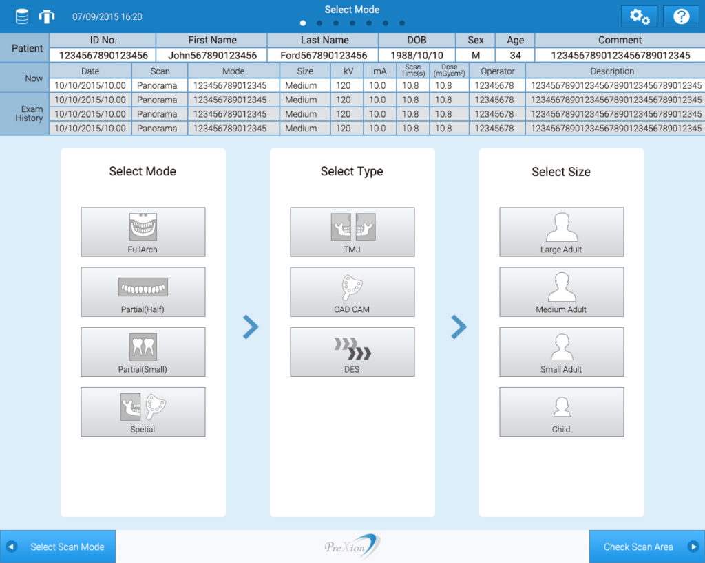
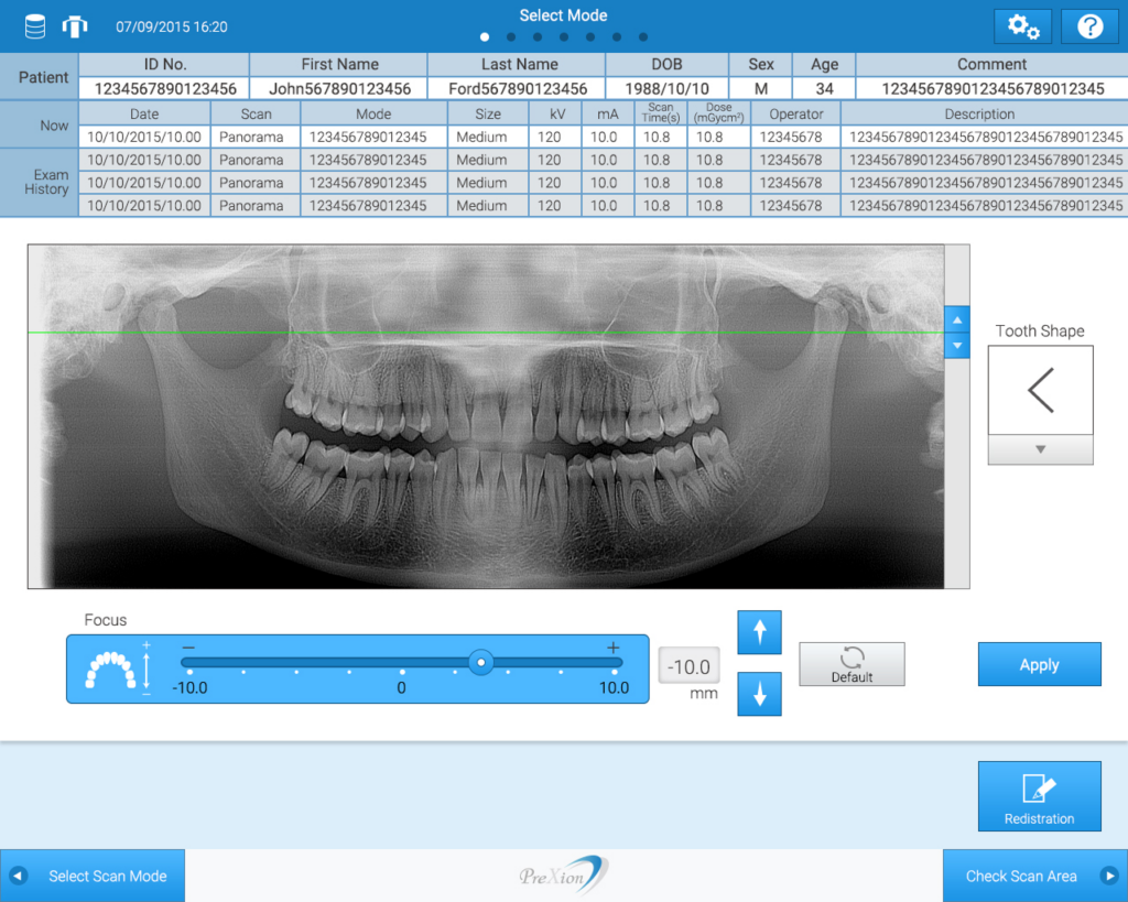
We were responsible for the design of both the position-adjustment touch panel monitor attached to the main unit and the primary console screen used for core operations.
Background
Redesigning with a refined, modern aesthetic
The previous UI had been designed over 10 years ago and strongly reflected the skeuomorphic style that was mainstream at the time. For this renewal, we were asked to update the design to a more modern, simple, and sophisticated look.
As the product is intended for overseas markets, the layout was designed to accommodate multiple languages such as English and German, taking differences in text length into consideration.
We also incorporated requests to create a more intuitive UI through the use of illustrations and icons, and to develop a premium design that harmonizes with the device’s silver chassis.
Proposal
Streamlined operation flow and efficient screen composition
Analysis of the existing model revealed that element placement did not align with the operational steps or natural eye movement, resulting in unnecessary user actions.
We reorganized the operational steps and clarified the priority of elements on each screen, redesigning the structure to enable natural visual guidance and smoother interaction.
From a visual perspective, multiple design directions were proposed. Ultimately, we selected a clean white base with the corporate blue as the key color, achieving both cleanliness and a sense of advanced technology.
Design Based on Cognitive Characteristics
Taking human cognitive characteristics into account, we optimized color proportions and layout balance so that information hierarchy can be understood intuitively. By effectively utilizing icons, we enhanced the speed of functional comprehension and reduced the learning curve.