Overview
Commissioned by ATOM Medical.
UI/UX design for maternal and fetal monitoring system for obstetrics and gynecology.
Design focused on enabling calm and accurate monitoring even in busy clinical environments, with clear visibility maintained from a distance.
Visual hierarchy and color scheme were carefully structured to avoid interfering with waveform observation, organizing controls and interface elements by information priority and unifying them through consistent, same-tone color usage.
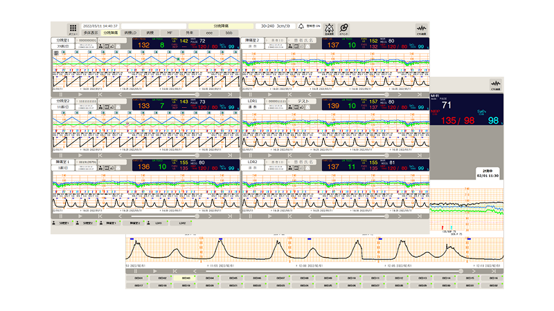
Background
Users reported that buttons and indicators with identical functions were duplicated within single screen, making interfaces difficult to understand.
In addition, large volume of information made critical data hard to identify quickly.
In clinical workflows, cases frequently occurred where assignment of patient information was forgotten at measurement start, leading to operational inefficiencies.
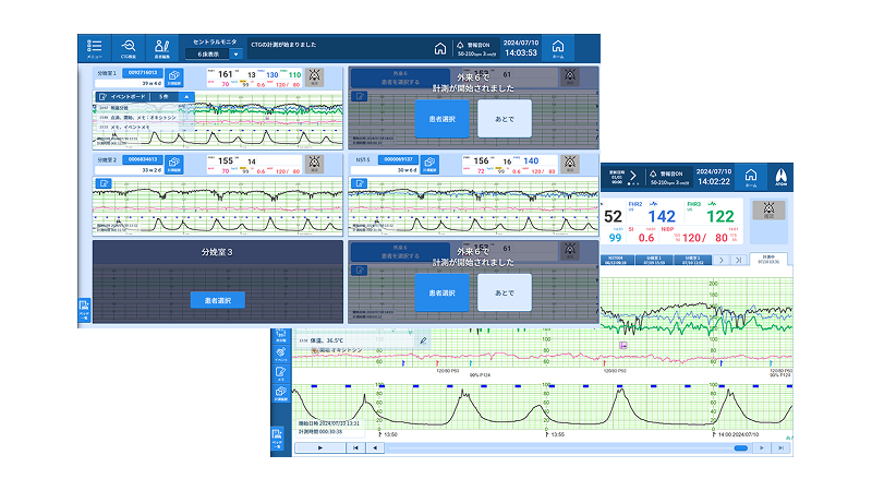
Proposal
Clear visual distinction established between control buttons and information displays.
To avoid interference with monitoring tasks, other controls and interface elements were treated as parallel information and unified under consistent, same-tone color scheme.
Design also introduced new UI specification that prompts patient information assignment at measurement start, reducing operational oversight and improving workflow reliability.
Outcome
We received feedback from facilities that switched from a previous model, stating that the number of incidents where users forgot to assign patient information at the start of measurement has become zero.